

Your social media post design is making an impression before anyone reads a single word. In a news feed full of competing content, a poorly designed post is skipped in milliseconds.
Good design doesn’t require professional software or an expensive designer for every post—but it does require understanding a few fundamental principles.
Here’s what the best-performing social media posts for Nepal brands have in common—and the design mistakes that are silently killing engagement for Nepali businesses.
The 3-Second Rule for Nepal Social Media Posts
A social media user in Nepal scrolls their feed at approximately 300 pixels per second. Your post has roughly 1.7 seconds to stop the scroll before it disappears.
This means the most important design decision you make is not the detail of your composition—it’s the single element that makes someone stop.
Three Elements That Stop the Scroll
A bold, large-text headline that creates curiosity
A striking, high-contrast image that stands out from surrounding content
A familiar face (a person, ideally looking directly at the viewer)
Typography: The Most Underused Design Tool in Nepal Social Media
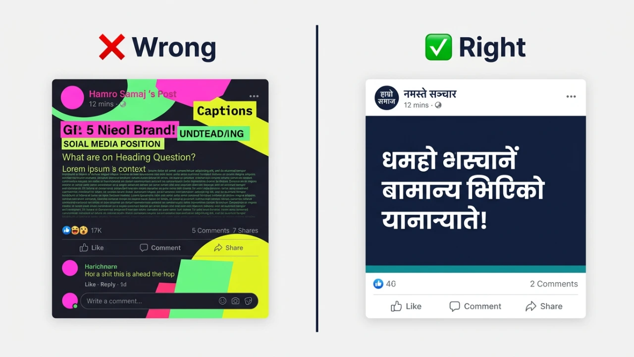
Use a Maximum of 2 Fonts
The most common design mistake in Nepali social media is using 3, 4, or 5 different fonts in the same post. Use one font for your headline and one for supporting text.
Consistency builds brand recognition. Variety creates visual noise.
Make Your Headline Huge
On a mobile screen, text that looks readable in Canva often becomes difficult to read when the post is viewed at phone size.
Your headline should be large enough to read without zooming—60 to 80 percent of the available text size in your composition for the main message.
High Contrast Always
Dark text on light background, or light text on dark background. Never dark text on a dark image without a text backing element.
Nepali audiences scroll quickly—low-contrast text loses readers before they engage.
Color: Using Nepal Brand Colors Consistently
Stick to 2-3 brand colors.
Your social media posts should use the same 2 to 3 colors consistently across all content. This builds instant brand recognition when someone scrolls past your post.
Color Associations in Nepal
Red: Associated with celebration, festivals, auspiciousness (use for promotions and festive content)
Blue: Trust, professionalism, stability (use for corporate or service businesses)
Green: Nature, health, freshness (use for food, health, eco-friendly businesses)
Gold/Yellow: Prosperity, quality, premium (use for luxury or aspirational brands)
Images: What Performs Best for Nepal Audiences
Faces Always Outperform Objects
Posts with human faces receive 38 percent more engagement than posts without faces, according to consistent testing across Nepal business accounts.
Show your team and your customers real people using your product.
Local Context Beats Generic Stock Photos
A photo of your actual Kathmandu office will outperform a generic office stock photo. A photo of your team at Swayambhunath will outperform a generic temple image.
Nepali audiences respond to authenticity and local recognition.
Action Shots Over Static Poses
Show people doing something—cooking, building, teaching, laughing. Action creates interest. Static poses feel staged.
What Not to Do: The 5 Biggest Design Mistakes Nepal Brands Make
Mistake 1: Too Much Text
If your post has more than 15 words on the image itself, it’s too much. Most users won’t read it. Put detailed information in the caption, not on the image.
Mistake 2: Low-Resolution Images
Blurry, pixelated images signal low quality to viewers. Always use high-resolution images—a minimum of 1080 x 1080 pixels for Instagram and 1200 x 630 for Facebook.
Mistake 3: Inconsistent Visual Style
Posting a minimalist design one day, a busy collage the next day, and a neon gradient the third day confuses your audience and weakens brand recognition.
Pick a consistent visual style and stick to it for at least 3 months before changing.
Mistake 4: Ignoring Mobile Preview
Design on desktop but always preview on mobile before posting. Text that looks perfect on a laptop screen is often unreadable on a phone.
Mistake 5: Copying Competitor Designs Exactly
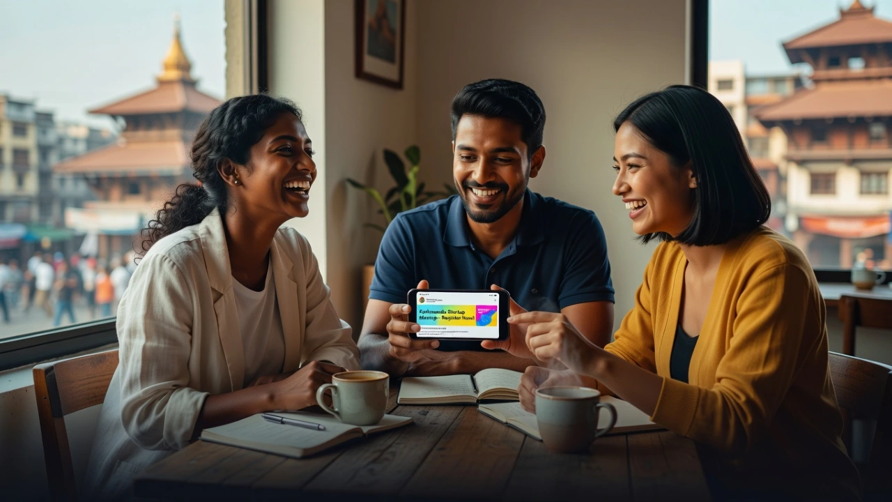
Getting inspired by competitors is fine. Copying their exact design style, colors, and layouts makes you forgettable.
Study what works, then adapt it to your unique brand identity.
Simple Tools for Nepal Businesses
Canva (Free and Pro)
Canva is the most accessible design tool for Nepali businesses. The free version is sufficient for most needs. The Pro version (NPR 1,000/month) adds brand kit features and removes the background tool.
Adobe Express (Free)
Similar to Canva with good templates. Particularly strong for video content.
Figma (Free for individuals)
More advanced, with a learning curve. Best for businesses creating detailed brand systems.
Social Media Design at Tech Babal
Our design and social media teams create on-brand, engagement-optimized posts for Nepal businesses. We handle all graphic design, maintain visual consistency, and optimize for each platform.
Learn more: techbabal.com/services/graphic-design